Alfani for Macy's
Alfani Seasonal Concept Development
Holiday 2019
October for Alfani represents a holiday palette cleanser for self purchase. The print themes to go after are a varsity continuation from fall mixed with photorealistic blooms to give the trend a feminine but modern twist. For color, clean blues back to a velvety golden shade mixed with neutrals and a black base with a blush layer up capsule.
November is our true Holiday collection. Deco/nouveau is the direction for the prints based on an inspirational visit to The Design Library for vintage art, mixing rounded florals and geometrics with sharper deco edges. Purple jewel tones will be a home run for all doors while a lilac shade will lighten things for warm weather customers. Mixed metals anchors this strong purple statement and helps bring in textural metallic fabrics and prints.
Transition 2019
December will be the perfect clean slate for self purchase with a focus on scale play with dots and stripes in new body shapes. Clean and blocked graphic blooms feminize this flattened message as well as a small hit of soft geo. Clean green with pink are a bright direction following rich holiday product. Black plays an important role here grounding each design, turning the pink into a modern and new feeling color bank.
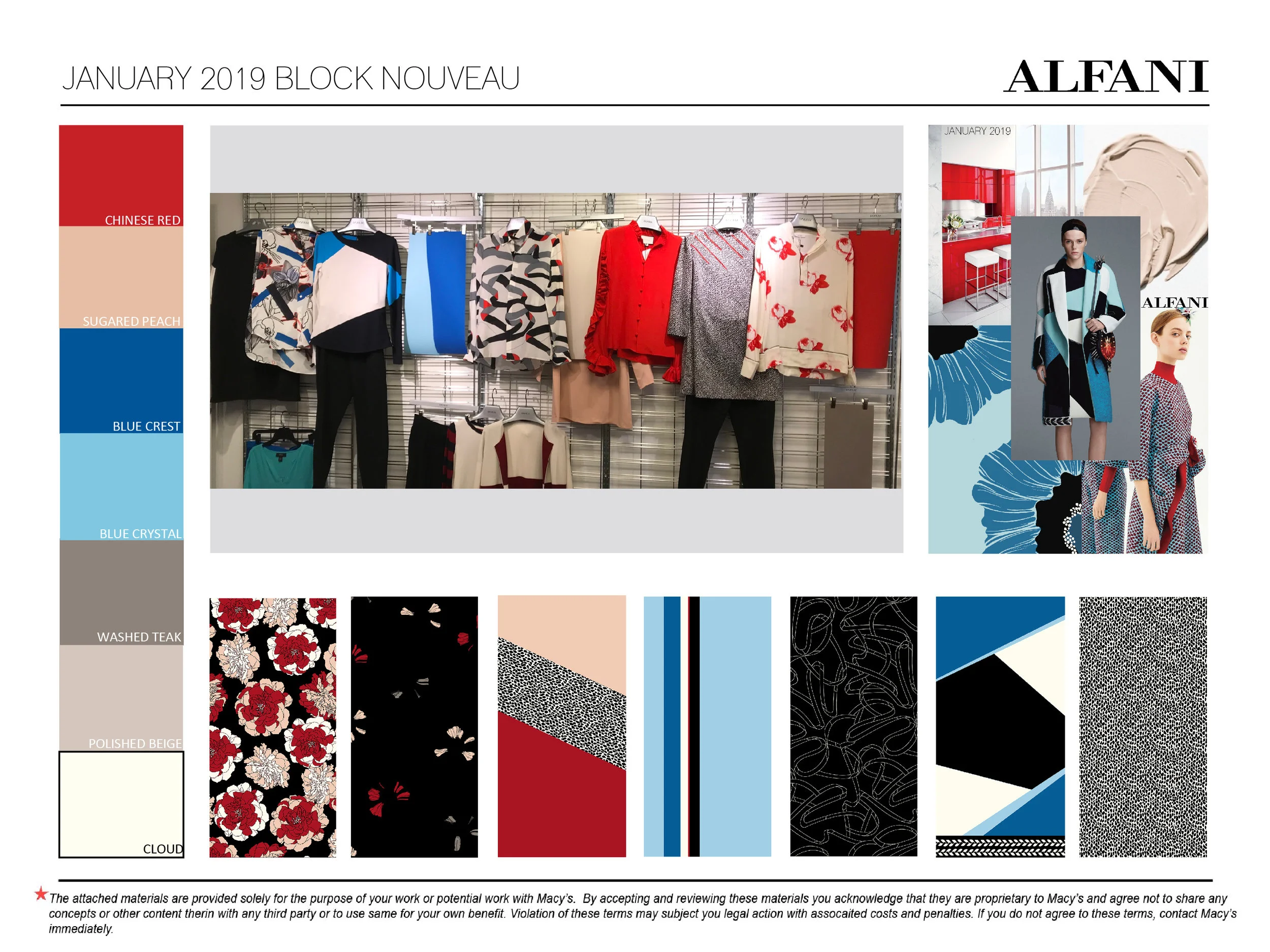
January is the first step towards spring and the perfect time of year for tonal red. Color blocking is key based on it's huge presence in the Spring 2019 runway shows mixed back to modern textures. Texture prints are updated using linework designs, animal shapes, and abstract petals; allowing her to interpret as best suites her personal style. Tones of blue come back here in cleaner shades to balance the red and create real impact on the selling floor.
SPRING 2019
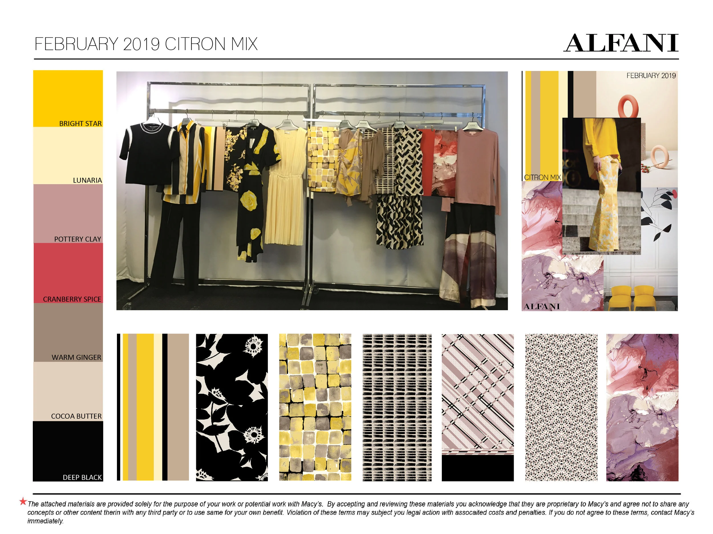
February embraces original paintings to lead the way in print direction. They mix with diaphanous geometrics and marbles to create a collection of masterpieces. The simple silhouettes will allow these pieces to shine as will the grounding effect of neutral tones with black. For color, yellow will be starting it’s season long journey in February with brights and butters. Mauve is introduced as well back to perfect early spring spice tones.
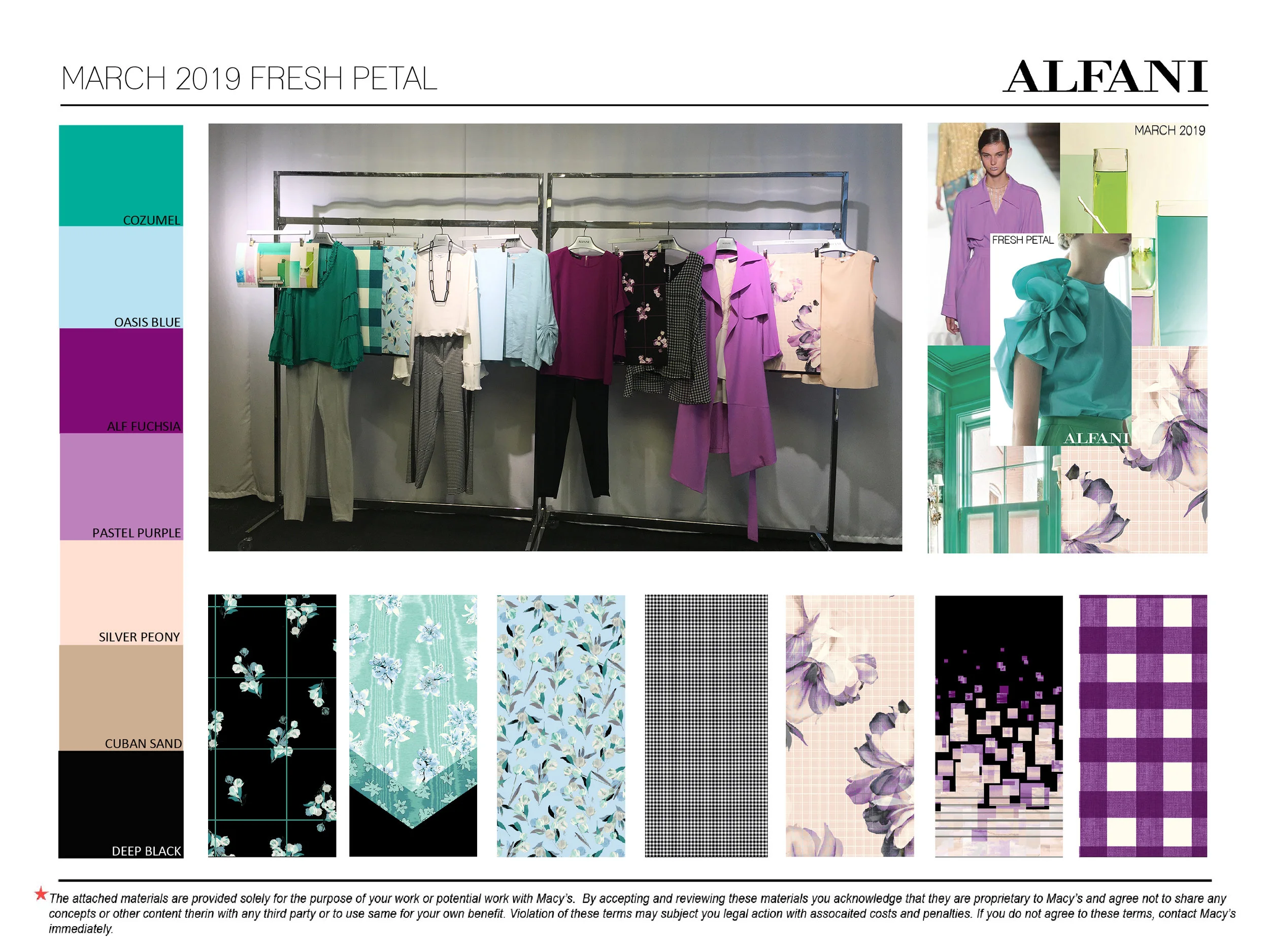
March is Alfani's true first spring expression both in color and print. The theme here is translucency both in the quality of the florals and the layering of the printing techniques. A variety of grids accentuate the modern side of spring when found nested with such color. Pastels are the lead playing off a vast range of blues, green, and violets creating a spectrum sure to draw her eye, and perfect for every holiday in spring.
SUMMER 2019
These deliveries were so enjoyable to work on. June goes trendy with multi prints and out of box colors. We dip into tie dye and brush prints here in modern silhouettes to stay on brand and mix back to super sharp art to make a contrasting statement. July takes those sharp edges even further. Powder blue, gold, and trend right chocolate help pixel prints, color blocking, and stripes juxtapose feminine tonal florals. This concept perfectly transitions the customer into the fall season.
HOLIDAY 2019
This holiday concept was a true departure for Alfani and something I’m very proud of. Each month has been separated into capsules that tell one cohesive story together. Each grouping has it’s own color story and theme with a very focused print story. October highlights gold as a metal mixed back to strong black and whites and tones of purple. It made a fantastic impact on the selling floor. November goes silver back to grey tones and beautiful berry shades. Both stories kept an incredibly modern and minimal print message using new dots and organic geometrics that were distinctly Alfani.
Transition 2020
The look is cleaned up post holiday shopping with neutral basics and modern graphics. Lime adds a pop to stark navy mixed with black and cognac. Mixed motifs keep the customer excited and ready to transition into spring. January flaunts romance with a stunning red and pink story. Graphics go more organic here with a slight marbling effect. We play with hearts in a minimal way to give her some fun as she looks towards spring. A new idea is introduced here with separate color and print story for our top doors. Cow prints and a hot red shade give trend forward direction for that fashionable spender.


