Charter Club for Macy's
Charter Club Artwork and Concept Development
Spring 2019 advertising video and print development
Summer 2019 mood boards and print development
Fall 2018 rebranded concept, updated crest design, and print development
2019 concepts and print development to continue the rebranding of a new fresh Charter Club
Transition 2019
December for Charter Club adds a fresh dose of prep to the floor with popping pinks back to a strong navy and touches of grey heather for that casual post holiday feeling. Striping feels good here on its own, blocked, and mixed back to classic florals and iconic prints. I also want to try some newer placement ideas for our tried and true bodies that will excite and feel fresh going into a new year.
January is all about primaries as we get closer to spring keeping the print themes very simple, allowing the color to shine. Multi prints feel great in this month in bold horizontal stripes, scarf prints, and ditsy florals; a change from the previous more tonal feeling. A punch of hot red and saturated yellow shade speak to both the classic customer and the trends for the season.
SUMMER 2019
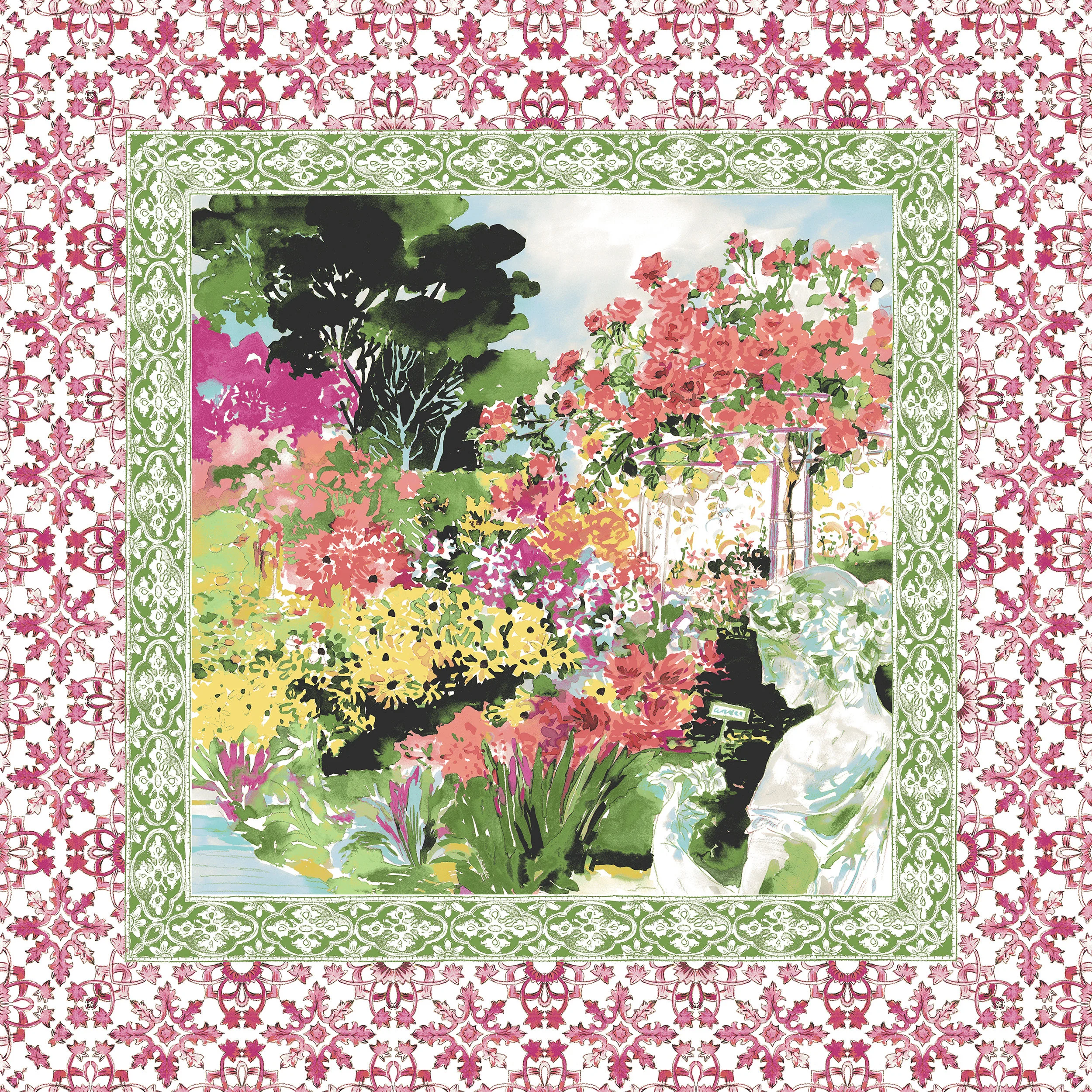
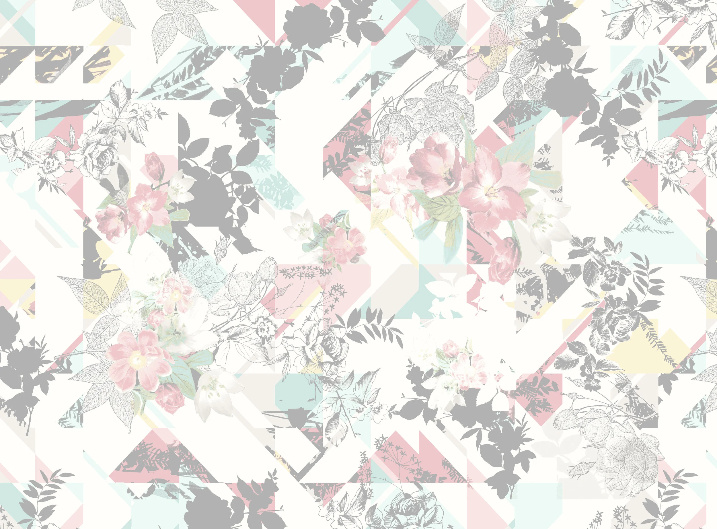
Summer is where Charter Club shines, we start with iconic geometrics and linework florals in April highlighting brights mixed with pastels. Pin dot mixing helps ground a statement yoke placement.
High summer in June brings aquatic motifs and washed prints. We highlight linen as a fabrication and create artwork that meshes into the fabric for a lifestyle feel. July brings back the hot brights as we play with paisley and tonal warm colorways. Bold solid grounds balance out denim blues to round out the season.
TRANSITION 2019
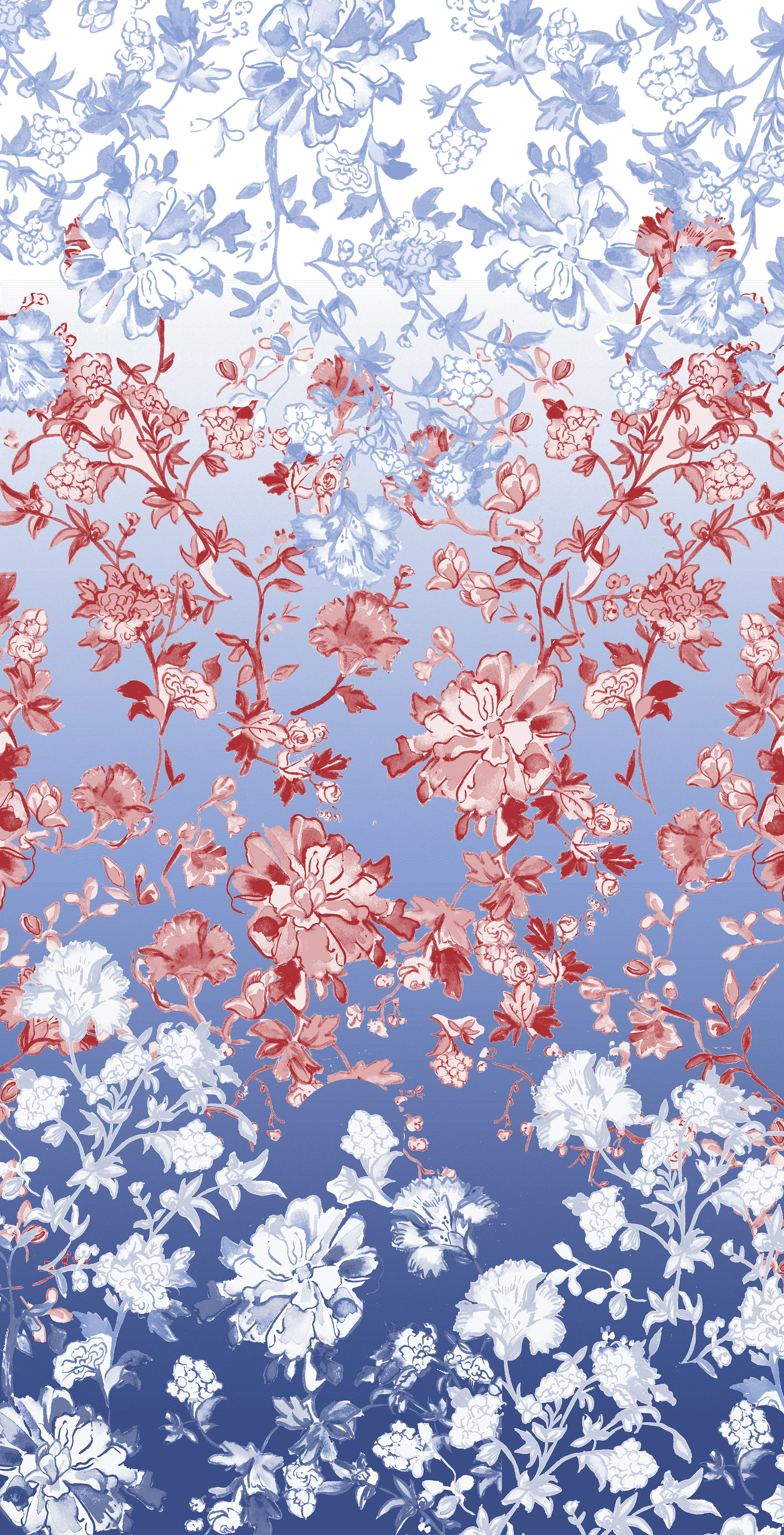
As we continue to simplify the brand message we combine the deliveries for December and January into one seamless story. It’s all about red and coral back to navy for the prints, sweaters in denim blue tones will accent this and lift it. Clean petaled flowers laid out in geometric patterns are the perfect accompaniment to the introduction of plaid. 2020 will be the year of the plaid and we want to start our story with bold grounded windowpanes. Stripes are iconic to the brand, to kick of the new year we want color. Multi stripe layouts are introduced for the first time in years across all programs and are an immediate hit with our customer. We will carry this learning into future deliveries.
SPRING 2019
This delivery was a proud moment for me and my team. I successfully combined two of our larger deliveries into one incredibly cohesive story that married new trends and forward thinking color. Muted pastels mixed with brights made traditional themes feel new. The season starts in February with a return to paisley taking one stunning artwork and flexing it across many categories in different iterations. The multi coloration in this palette feels right for the customer and connects the months on the floor. The delivery flows into March introducing the smallest scale florals this brand has done as a front line statement. Again the motif has been flexed into many variations to create story telling but give each piece a reason to be.


